July 18, 2013
Dealing with Edge Cases in Product Design
Designing simple products is hard. Software that starts simple has the tendency to become more and more complicated as time goes on. Ideas come pouring in from customers for that next ‘must have’ feature. In many cases, those features are actually edge cases that will only be useful to a small subset of customers. Trying to optimize an interface to serve all of these edge cases will quickly lead to complexity. It’s our instinct as designers to optimize functionality to the fewest amount of clicks and screens, but when adding edge case functionality, it should be deprioritized in order to keep primary use cases simple.
Some may argue that the ideal situation is to keep your product in its simplest form, never supporting any of these edge cases. That approach may satisfy design purists following a sacred set of ideals, but it is often unrealistic when you’re trying to grow your customer base. At HubSpot we’ve learned that adding this type of functionality is ok, as long as it stays out of the way of the main use cases.
Your product doesn’t need to allow for edge case tasks to be completed quickly and easily. Advanced users are willing to click a few extra times for advanced functionality. The benefit they receive from that advanced functionality is often worth the extra effort. Beginners will also benefit from not being intimidated by a myriad of features they don’t understand.

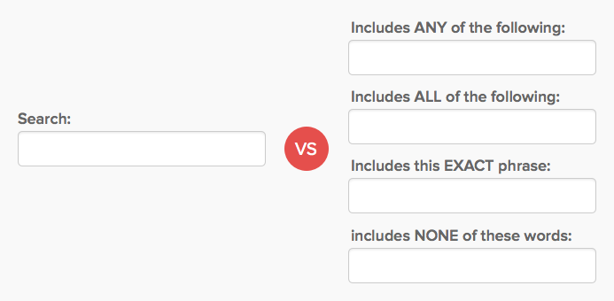
One of the best examples of this principle in action is Google Search. There’s a ton of advanced search functionality that has been added over the years, but the home page remains just a single input box. In order to access advanced search features, you either need to know advanced query syntax, or find the advanced search link buried in a drop down menu on the results page. Google recognizes that a majority of their users don’t need that advanced functionality, and keeps it out of the way.
It sounds easy, but in practice it’s much harder. Our design instincts tell us to optimize for the fewest number of clicks and screens. We are always trying to create a delightfully simple experience for all our users. But we must ignore those instincts when dealing with edge cases in order to keep our products simple.
